PROJECT – 2021
National Parks Service
The National Park Service uses its web presence to share and communicate park information with the general public.
However, when observing attempts to obtain park information and set up a camping reservation, it became clear that the process instilled confusion, uncertainty, and frustration.
TEAM
Project lead, user & industry research, design, testing
ROLE
Keegan Brown, UX Designer
MaryKate Scrobe, UX Designer
Sinead Willis, UX Designer
CLIENT
National Parks Service
TASK
Apply a thoughtful design process to identify one key problem and ideate a digital experience which would resolve the deficiency
DURATION
2 weeks
TOOLS
Figma, Miro, Sketch
METHODS
User Interviews, Affinity Mapping, Sketching, Usability Testing, Iterative Wireframe Prototyping, High Fidelity Prototyping
PROBLEM
The National Park Service maintains large amounts of information on each of its national parks. Within the domain of a single park, numerous sub-pages exist, each containing focused material. Despite this organization, users experience confusion navigating through the site. Observations show struggles to find park information and puzzlement when booking campsite reservations.
The intention of the National Park Service site is to provide users with relevant information in a timely manner; instead, efforts are met with confusion.
PROJECT BACKGROUND
The National Park Service aims to preserve natural and cultural resources, as well as the values of the National Park System for this generation and those to come. In the United States, there are sixty-three national parks, and the National Park Service website contains information on each of them, plus more.
One of our team members, Keegan Brown, mentioned she had started planning for a camping trip at a National Park, and had experienced challenges when doing so. In particular, she mentioned that she had trouble finding relevent information to follow through with a camping reservation.
There is a division of information and functionality that poses challenges to visitors of the National Park Service (NPS) site. Reservations are completed on Recreation.gov, whereas information about the park, and in some cases information about reservation dates, can be found on the NPS site.
The information regarding when you can make a reservation is located on the NPS website, whereas the ability to set up a reservation is available through Recreation.gov.
Can we not combine the two resources into a single, one stop shop providing national park information in addition to the ability to make a reservation?
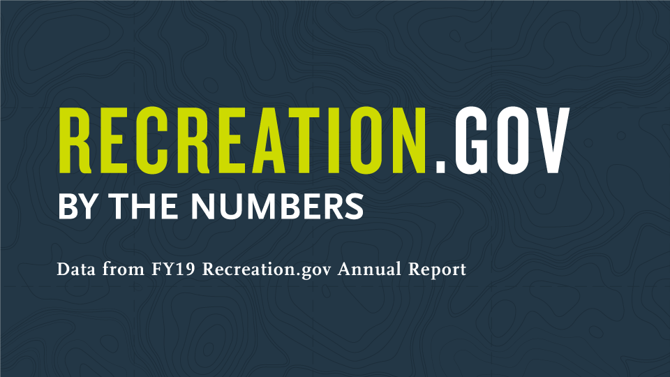
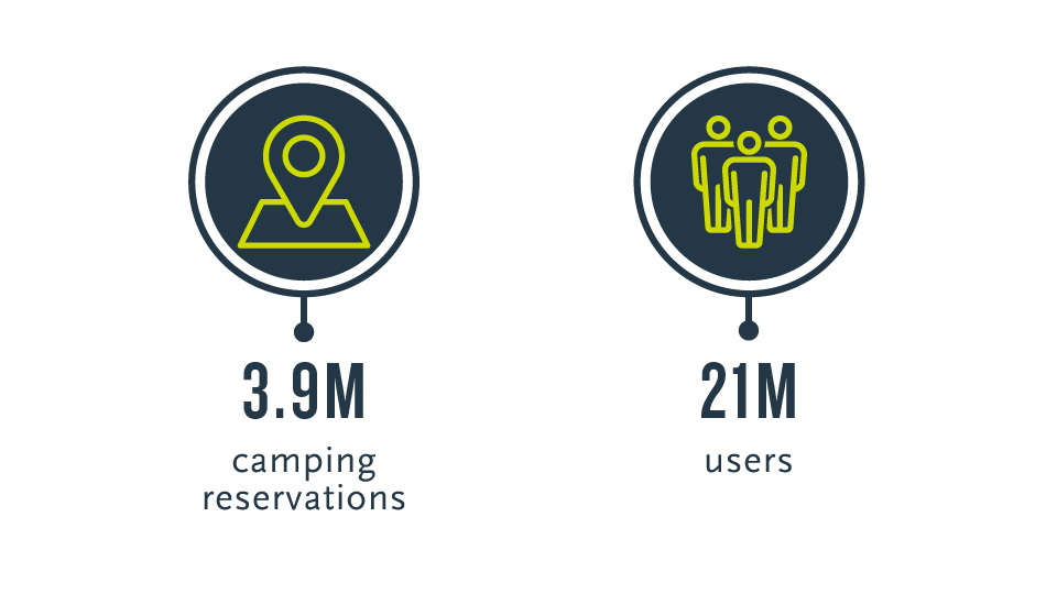
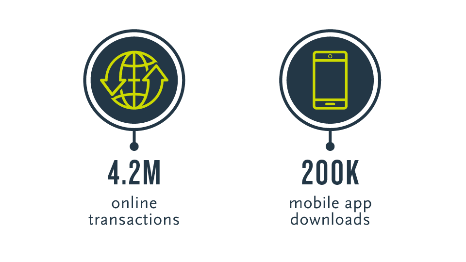
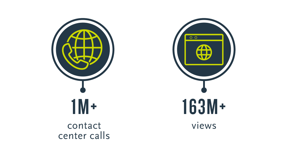
NATIONAL PARK SERVICE vs RECREATION.GOV
After I spent time digging deeper into the relationship between NPS.gov and Recreation.gov, it became apparent that the role of NPS.gov is to be an informational resource, whereas the role of Recreation.gov is to support and handle all things reservation related.
Beginning in 2017, a 10 year, $182 million dollar contract was awarded to Booz Allen Hamilton Inc. who's goal was to revamp and modernize Recreation.gov (source).
Since then, more than 100 campgrounds have been added to the platform, and it is clear Reservation.gov will be considered the solution to reservation management for the forseeable future.
With this in mind, the team began to form the scope of the solution to address implementation feasibility given the arrangement between NPS.gov and Recreation.gov. While API integration between the two resources is certainly an option, the team decided to move forward with a stop-gap solution and propose improvements to the NPS.gov website.
But, which improvements are needed?
INTERVIEWS
With hopes of identifying potential improvements, the team conducted user interviews with 8 participants to a) collect contextual data on our users, and b) observe a task using the current nps.gov website.
The task observation portion of the interviews proved to be the most advantageous, showing remarkable insight into areas in need of improvement. We can utilize the path's taken by participants and the mistakes therein to determine problem areas.
TASK: FIND INFORMATION ON YOSEMITE NATIONAL PARK, THEN RESERVE A CAMPSITE.
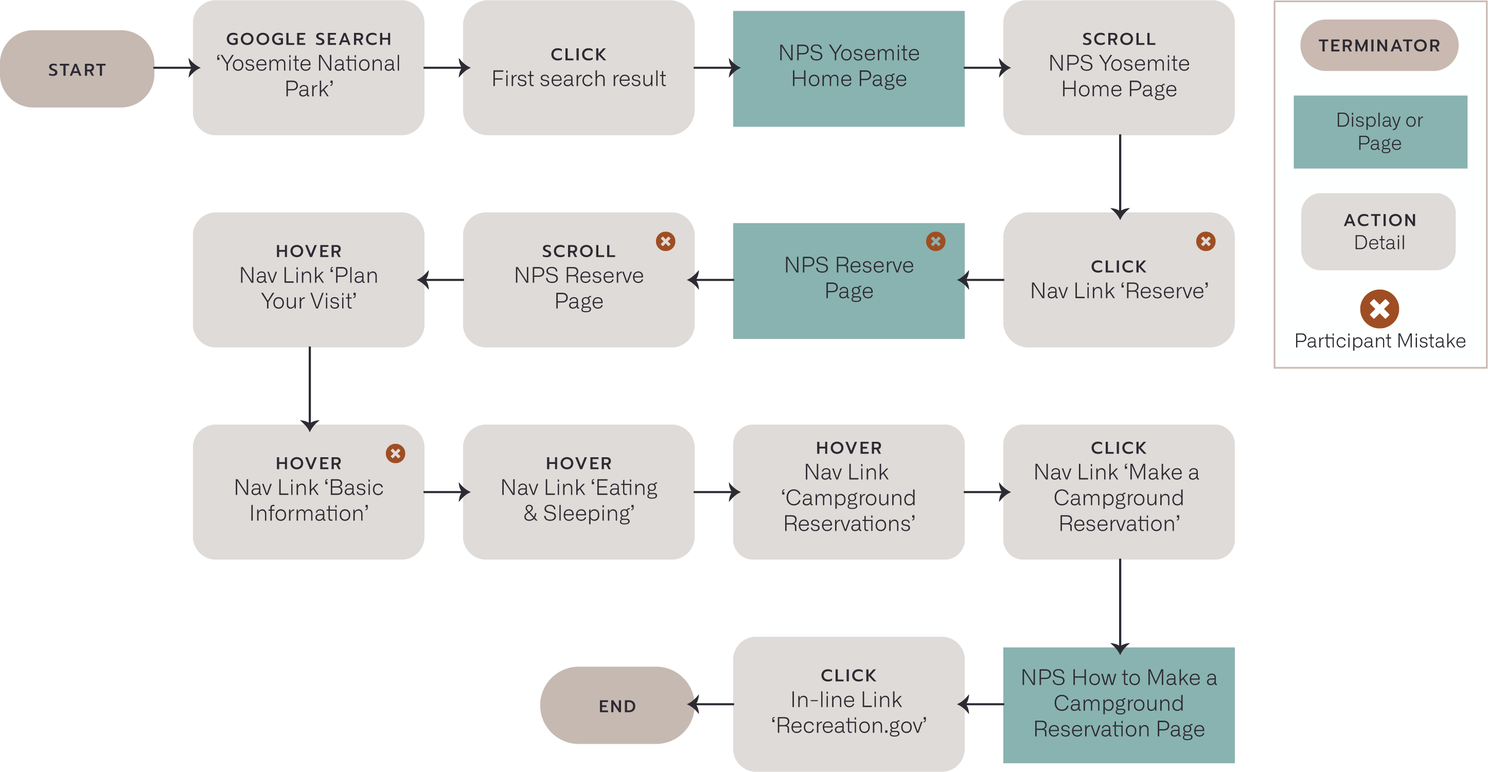
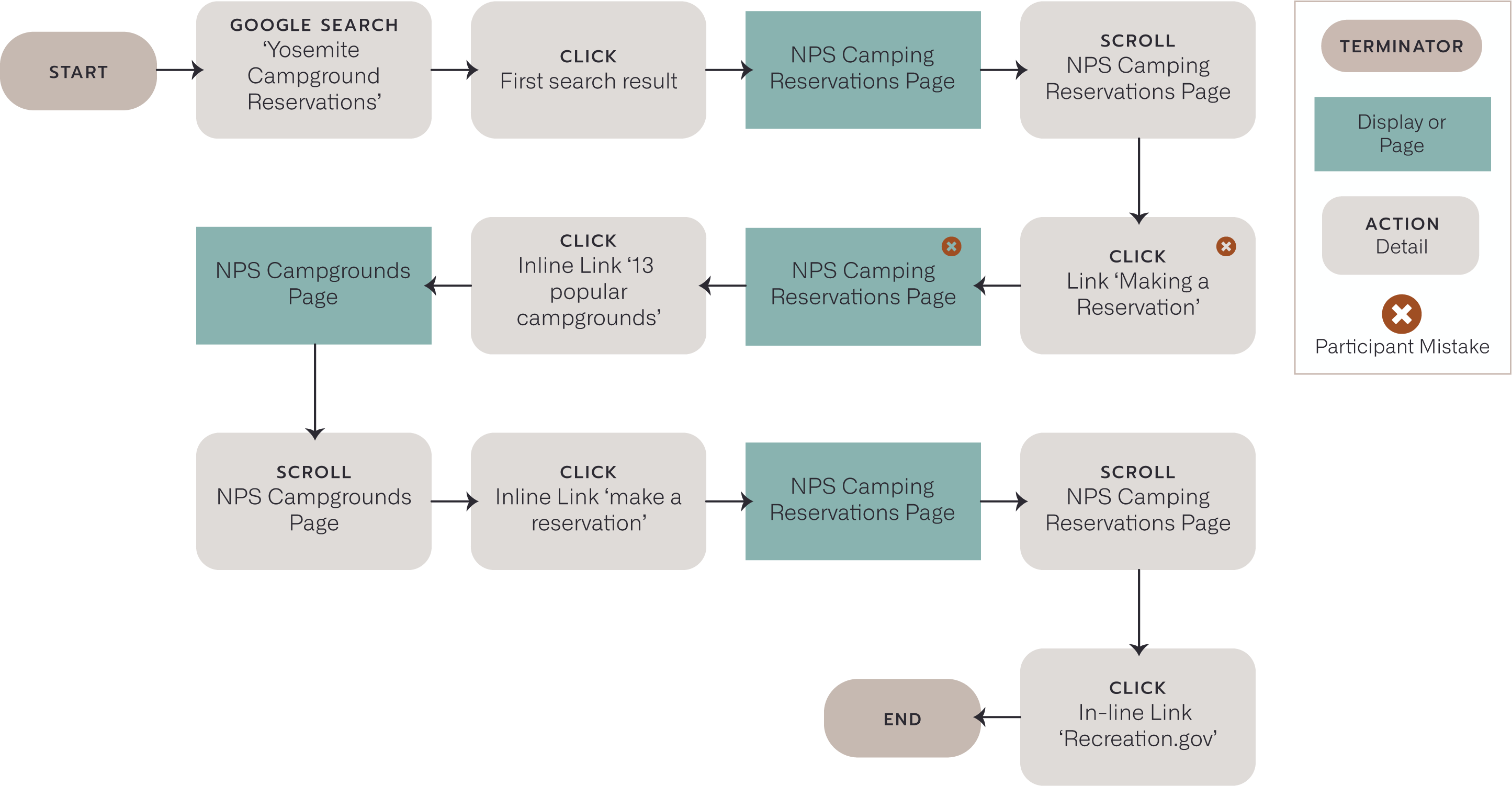
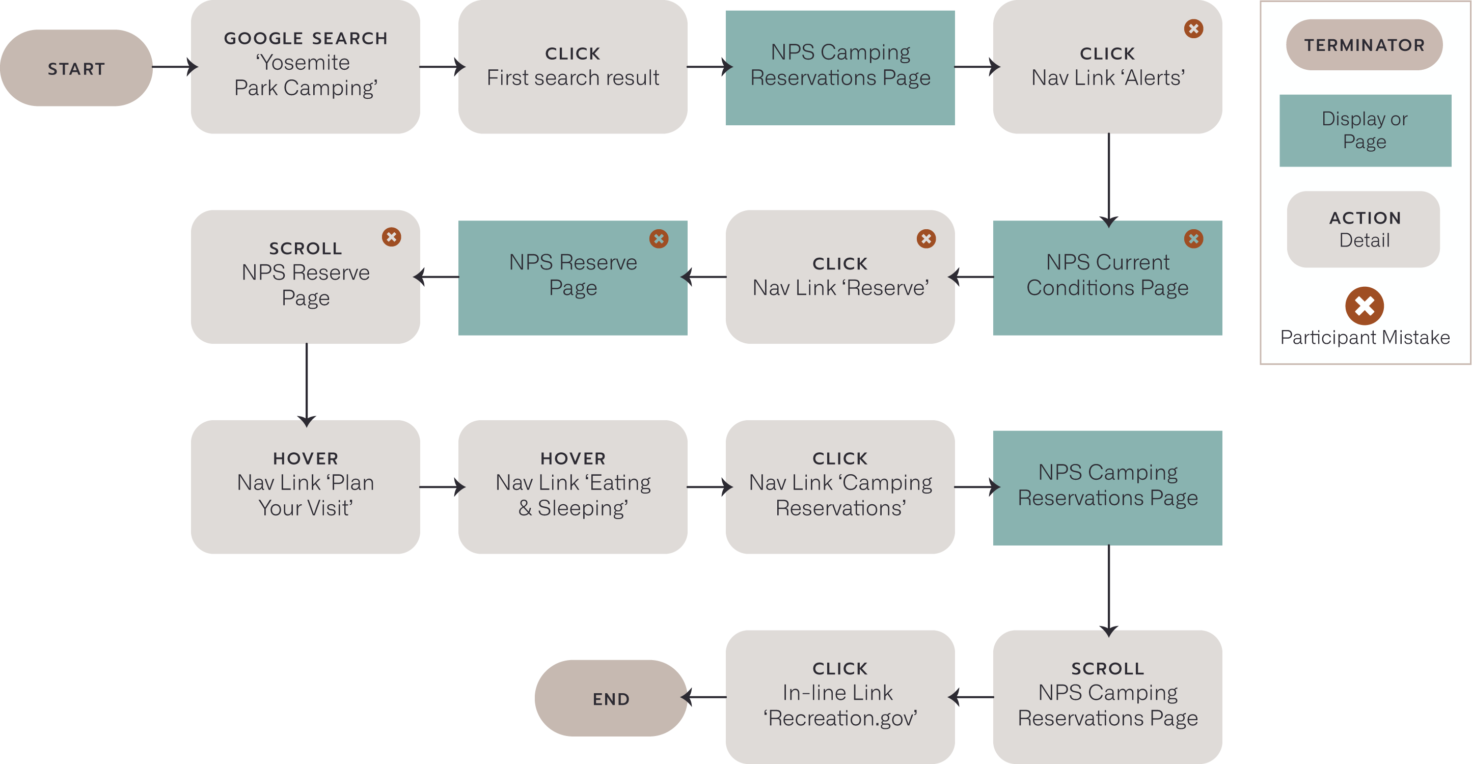
OBSERVATIONS BASED ON TASK USER FLOWS
Goal 1: Find Yosemite National Park information
- 29% of participants were unable to find park information
Goal 2: Set up a reservation at Yosemite National Park
- 43% of participants made at least one mistake when attempting to make a campsite reservation
- 29% of participants visited the reservation page more than once before finding the link to continue the reservation process
- 29% of participants clicked on a link in the local navigation labeled 'Reserve' (this page is intended to provide information on permits)
&
FEEDBACK SHARED DURING TASK
"There is too much text, I'm not going to read
all of this."
"This site looks like most government
sites, outdated."
"Oh! Looks like I am being re-directed to another site. I guess I have to start over..."
CONCLUSIONS
Coming out of the research phase, we are able to synthesis our findings into themes describing opportunities for improvement

CONFUSING NAVIGATION & POOR CONTENT PRIORTIZATION

SUBPAR USER ENGAGEMENT

UNEXPECTED SITE RE-DIRECT

OUTDATED SITE AESTHETICS & STYLE
Our Vision – Simplify the Experience.
DESIGN
The team collectively created a new user flow while thinking about problem areas discovered in the research phase. The focus is centered around improving the flow of the interview task...
TASK: FIND INFORMATION ON YOSEMITE NATIONAL PARK, THEN RESERVE A CAMPSITE.
After finalizing the new user flow, the team got to work re-designing the pages contained within the new flow. Each team member independently created sketches, then we came together to create a version that incorporated design concepts that best addressed the problem areas.
MODIFIED USER FLOW
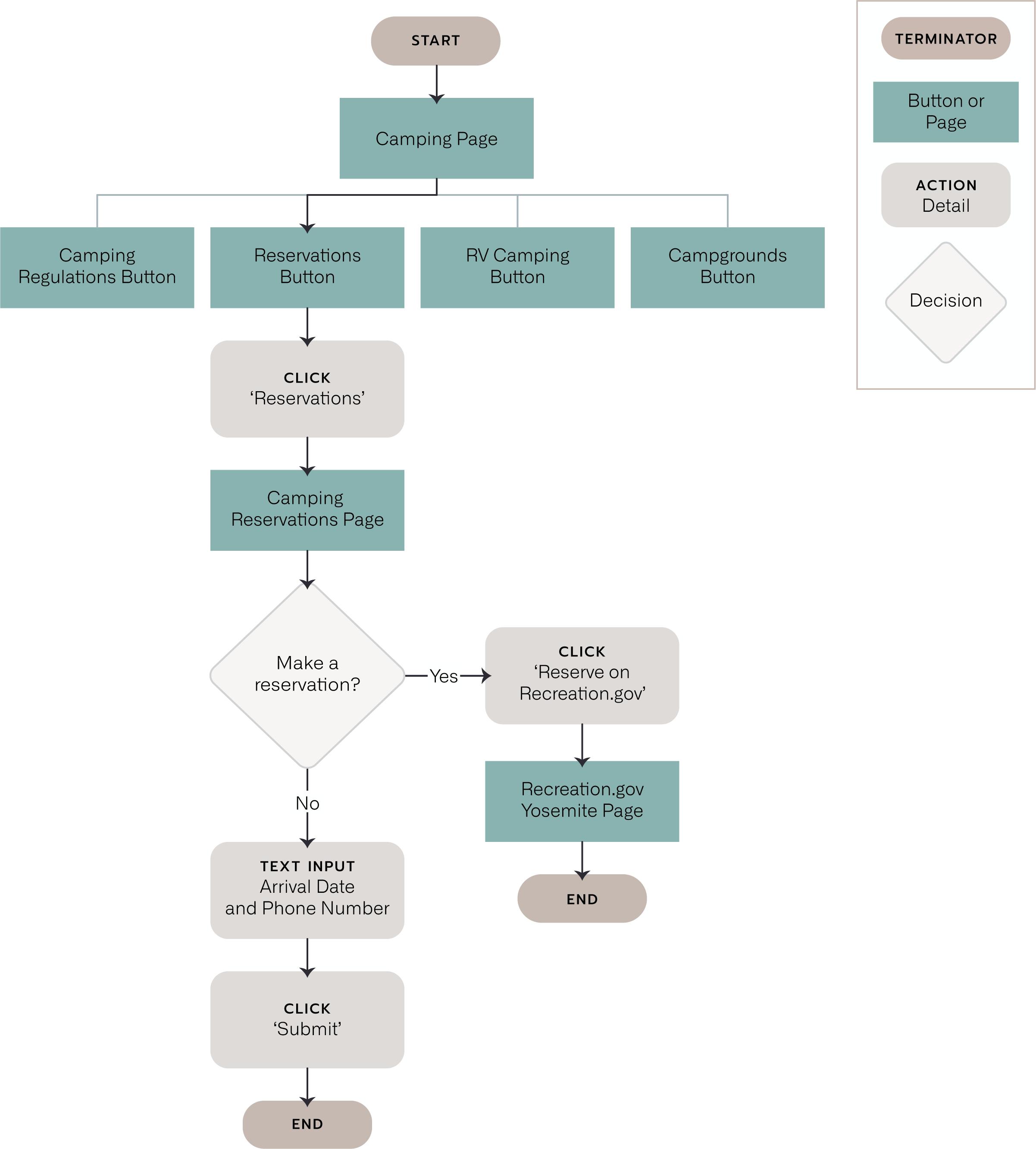
IDEAL PATH TO MAKE RESERVATION
The creation of a modified user flow helps visualize the ideal path to complete the original task; this way we can measure improvement with an apples-to-apples comparision in usability testing.
The user flow represents the path starting from a centralized camping page (specific to Yosemite) and ending with a site re-direct to complete a camping reservation.

CONFUSING NAVIGATION & POOR CONTENT PRIORTIZATION
Consolidated information into fewer pages
i.e. all camping related information is located on the camping page or linked from the camping page, and all reservation related information is located on the reservations page or linked from the reservations page landing on Recreation.gov
SIMPLIFIED LOCAL NAVIGATION
Before
After
TOO MANY OPTIONS
During the interview task, participants were misled by the abundance of local navigation options.
When participants realized they were unable to find the content they were looking for, they turned to the navigation menus and made comments regarding how related information was spread amongst multiple pages, making it difficult to land on the correct one.

CONFUSING NAVIGATION & POOR CONTENT PRIORTIZATION
Removed fourth level of local navigation, leaving only the main pages 'Lodging,' 'Dining,' and 'Camping'
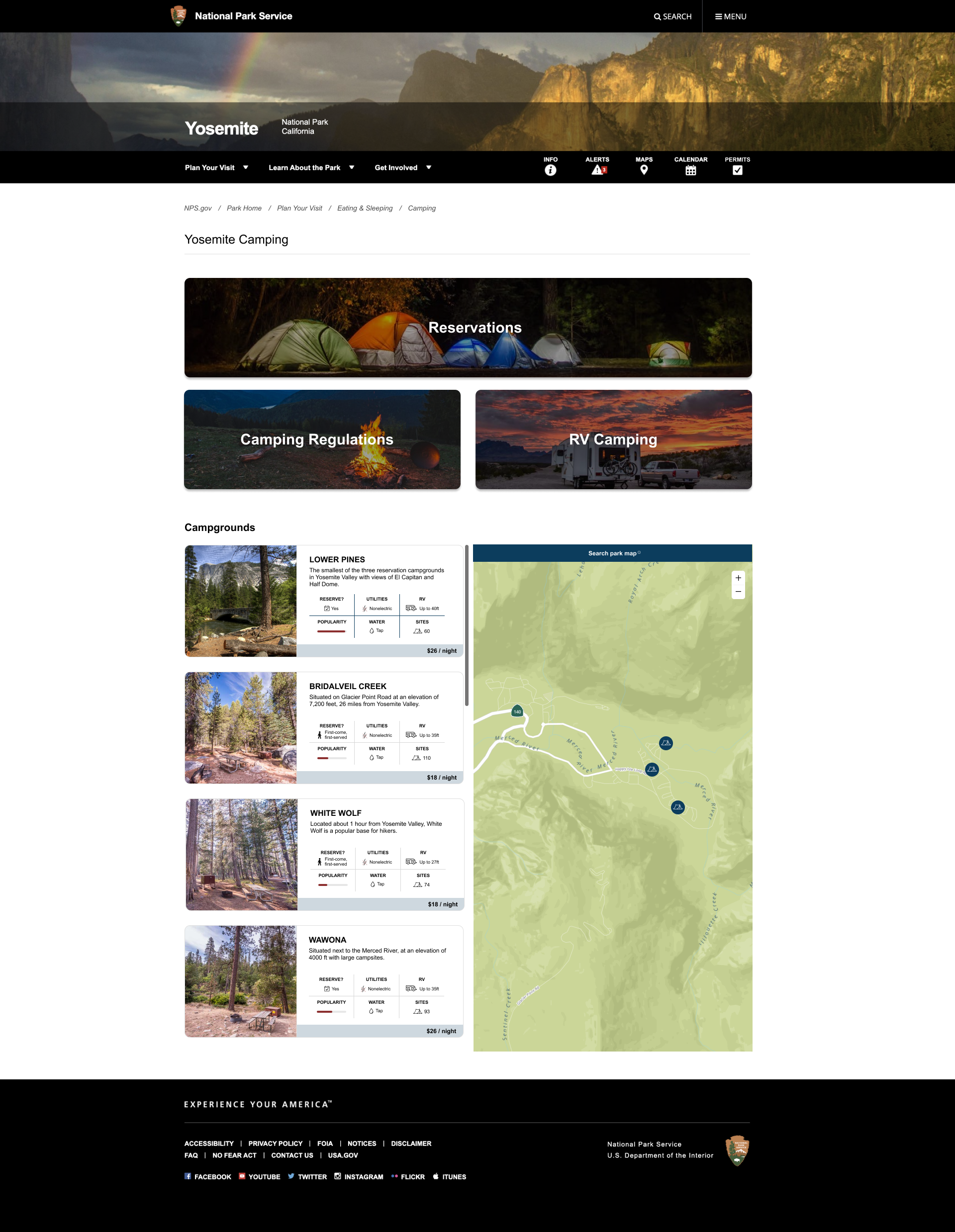
IMPROVED CAMPING PAGE
TOO MUCH TEXT
During the interview task, participants scrolled about the Camping page looking for reservation information, without reading the text. When asked about this behavior, participants mentioned they did not, and in general would not spend time reading through a page with this much text.
Participants also commented about the fact that the map image was flat, i.e. not interactive, and the table with park campgrounds was difficult to read and overwhelming.

CONFUSING NAVIGATION & POOR CONTENT PRIORTIZATION
All camping related information and links were consolidated to this page

SUBPAR USER ENGAGEMENT
Large bodies of text are summarized and relocated to appropriate sub-pages, frequently used links are now located at the top of the page

OUTDATED SITE AESTHETIC & STYLE
A new layout is introduced, including a responsive list/map split screen to showcase national park campgrounds, a similar format to various realty sites, or Airbnb
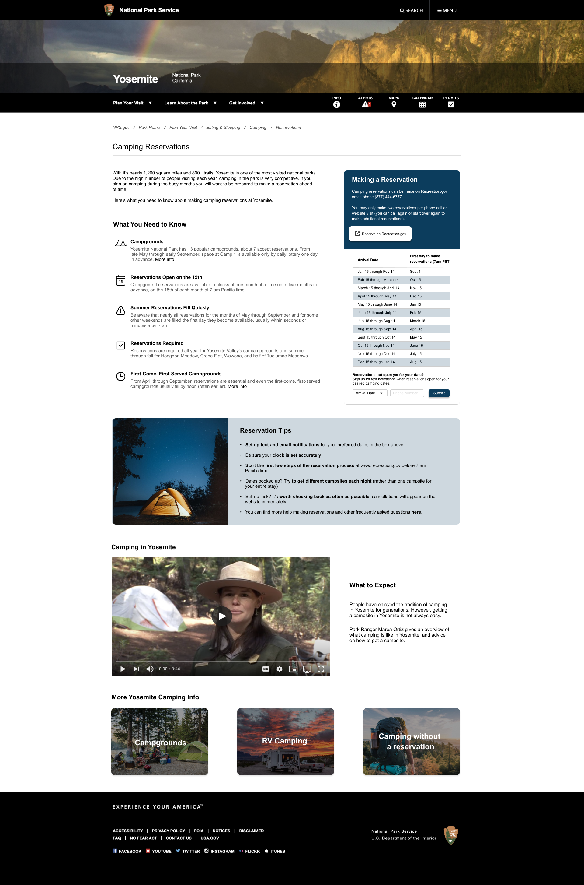
IMPROVED RESERVATIONS PAGE
RESERVATION NEXT STEPS UNCLEAR
Looking back through the participant user flows, I noticed a pattern where the Reservations page was visited multiple times before finding the link (located on the Reservations page) to complete the interview task. More emphasis on the available actions could improve this.
Additionally, 86% of participants mentioned that date information and availability is the most important factor to be addressed when making a reservation. The current design makes this difficult, reservation open dates are not emphasized on the page, and the page section with this information is cut off by the broswer viewport, requiring scroll.

CONFUSING NAVIGATION & POOR CONTENT PRIORTIZATION
All reservation related information and links were consolidated to this page

UNEXPECTED SITE RE-DIRECT
Button text modified to indicate this button's action is to re-direct to another site
Re-direct icon added to button for further clarity

SUBPAR USER ENGAGEMENT
Large bodies of text are summarized and formatted as bulleted lists with icons, navigation section removed leaving one link to redirect to make a reservation

OUTDATED SITE AESTHETIC & STYLE
A new, more modern layout introduced with more white space between text making the content more digestable
Feature Spotlight
RESERVATION DATES – TEXT REMINDERS
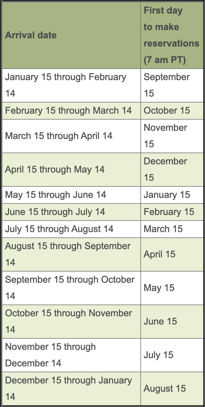
Original Reservation Date Table
Re-design Version 1 & 2
According to feedback gathered from user interviews, reservation dates are the most important factor when making a reservation.
When we asked participants about the intention of the reservation date table on the NPS website, most were not able to answer, or were not able to interpret the information. We thought, since reservation dates are so important, we could improve upon the way the information is portrayed.
After discussing as a team, we decided to propose a solution where we would get rid of the table altogether and provide an opportunity for users to input their planned travel dates and recieve information on whether the reservation time window is open, or not.
However, when testing the usability of the re-designed pages and this new feature, we found participants were even more confused about what the date information was intended for.
Most participants thought that this section was meant to accept travel dates to complete a reservation, when the real intention was to inform users of when they can make a reservation.
I recognized the mistake here, the format of inputing a check-in and check-out date into a form is associated with most booking sites, e.g. booking a plane ticket or a hotel room.
I decided to pivot back to the original table format, and considered adding a dropdown menu with travel date windows so the user could still input their travel dates and recieve feedback on when reservations will open (or if they are already open.)
Our team member Keegan proposed we include a text reminder feature, where users could input their travel dates (under 'Arrival Date' dropdown) and their phone number, then subscribe to text reminders before reservations opened so they would not miss the opportunity to snag an available campsite.
After another round of usability testing with the text reminder feature, we were happy to find that all participants were able to explain the purpose of the text reminder feature, and all participants stated they would be interested in using this feature if it became available.
CONCLUSIONS
Government sites have a reputation for being wordy, outdated, and generally frustrating to use. Thinking about how to improve upon the design seemed easy at first, however it was humbling to realize just how difficult it is to share high volumes of information in an organized, intuitive way.
As a team, we spent 10 days working on this re-design. Stemming from my background in project management, I was focused on ensuring we did not allow scope creep to impact our timeline. As we explored deeper into this project, it was tempting to try and 'fix everything.'
Next steps include,
- Research into the possiblities of creating hooks from the National Parks Service to Recreation.gov
- Further investigation using card sorting to nail down the appropriate information architecture that can be applied to all park pages within the NPS site


