PROJECT – 2021
LIVE A GREAT STORY
LIVE A GREAT STORY is looking to create a platform that allows its users to continue the tradition of sharing inspirational stories, giving back to the very community that encouraged their positive life-changing decisions in the first place. The power of storytelling and the potential impact contained within are the original building blocks of the movement and brand.
ROLE
Project Manager, general contributor
TEAM
Julius Franklin, research lead
Derya Ibic, UI co-lead
Art Phung, UI co-lead
CLIENT-SIDE STAKEHOLDER(S)
Zach Horvath, founder & owner
CLIENT
LIVE A GREAT STORY
TASK
Create a simple online storytelling and sharing experience for client utilizing research, synthesis, and UI design to develop a high-fidelity prototype of website
DURATION
3 weeks
TOOLS
Figma, Miro
METHODS
Surveys, Affinity Mapping, Comparator Research, Sketching, Usability Testing, A/B Testing, Iterative Wireframe Prototyping, High Fidelity Prototyping
LIVE A GREAT STORY is a message-driven, e-commerce brand that encourages people to be the hero of their story.
Numerous types of products are available through the brands digital storefront containing variations of the logo and message, with a goal of being a reminder to live life on your own terms.
CLIENT-FACING PAIN POINTS
To kick off the project, the team first met with the client to understand business needs. We were able to summarize the business pain points into three general statements, all relating to sharing stories.
01. Difficulty identifying a story sharing medium that engages the community
02. Lack of high-quality visual media accompanying story submissions from the community
03. Lack of diversity represented by brand through social media and web content
Using these pain points, we began to form survey questions aimed at uncovering the the user's perspective around these topics.
More specifically, we wanted to understand story telling motivators and behaviors around sharing online via social platforms, paying attention to patterns that could emerge from different demographic groups.
RESEARCH
The team utilized a combination of a user survey driven on our end, and client-driven survey data, google analytics from current website, and instagram statistics from current brand account.
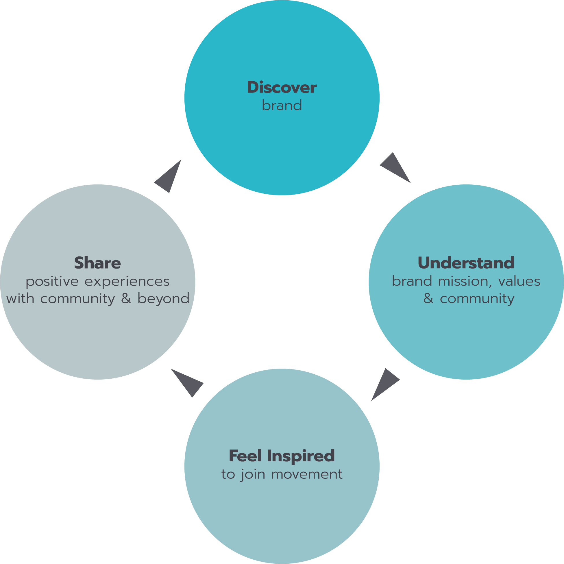
Before finalizing survey questions, I put together a user journey map showing the cyclical stages a customer moves through when interacting with a brand. The client-facing pain points are contained in one particular segment of the journey map, 'Share,' whereas our survey questions were reformatted to gather information pertaining to every stage.
USER JOURNEY
Moving into the research phase, the team faced challenges connecting the client-facing problems with potential user problems.
How do we know that sharing stories is a problem users are facing? Shouldn't we expand our questions to encompass the whole user journey when interacting with this brand?
After a discussion with colleague Mary Murphy, we resolved to zoom out and investigate the entire user journey.
SURVEY RESULTS
Our survey was focused around perceptions of the brand based on current web presence, and consumers relationship with other comparator brands– here we specifically dug into characteristics that foster brand loyalty.
How would you describe this brand?
After visiting the brand website, are you left with any questions or concerns?
"White people, vague idea of happiness and fullfilment."
"Very white and thin, vaguely sporty/outdoorsy."
"Insta influencer vibes"
"Not really sure what the value proposition is of the brand, aside from pushing branded merchandise."
"Merch store."
"The purpose of "Live A Great Story" is so nebulous, only general senses of unity, agency, and adventure are what is being advocated."
Share descriptors that come to mind when thinking about the types of people who would gravitate towards this brand.
"I don't really know how buying clothes will bring real happiness."
"It feels appealing to middle class or debt free younger white men and women."
"Its a priviledge to be able to choose where you go and what experience you have. I wish there was more emphasis on telling your own story even if it doesn't include things like outdoor adventures and travel."
"The target market should be humans."
"People with money who have access to travel."
SYNTHESIS
Using survey results and client-facing pain points, the team conducted a visual comparision to identify common trends or patterns with a goal of narrowing in on the actionable problem. Additionally, a persona was built based on the most frequent user to our clients website according to google web analytics.
After identifying the problem in the form of new pain points from both user and client perspectives, the team began scoping the high-level design changes. To do this, we created user flows.
NEEDS COMPARISION
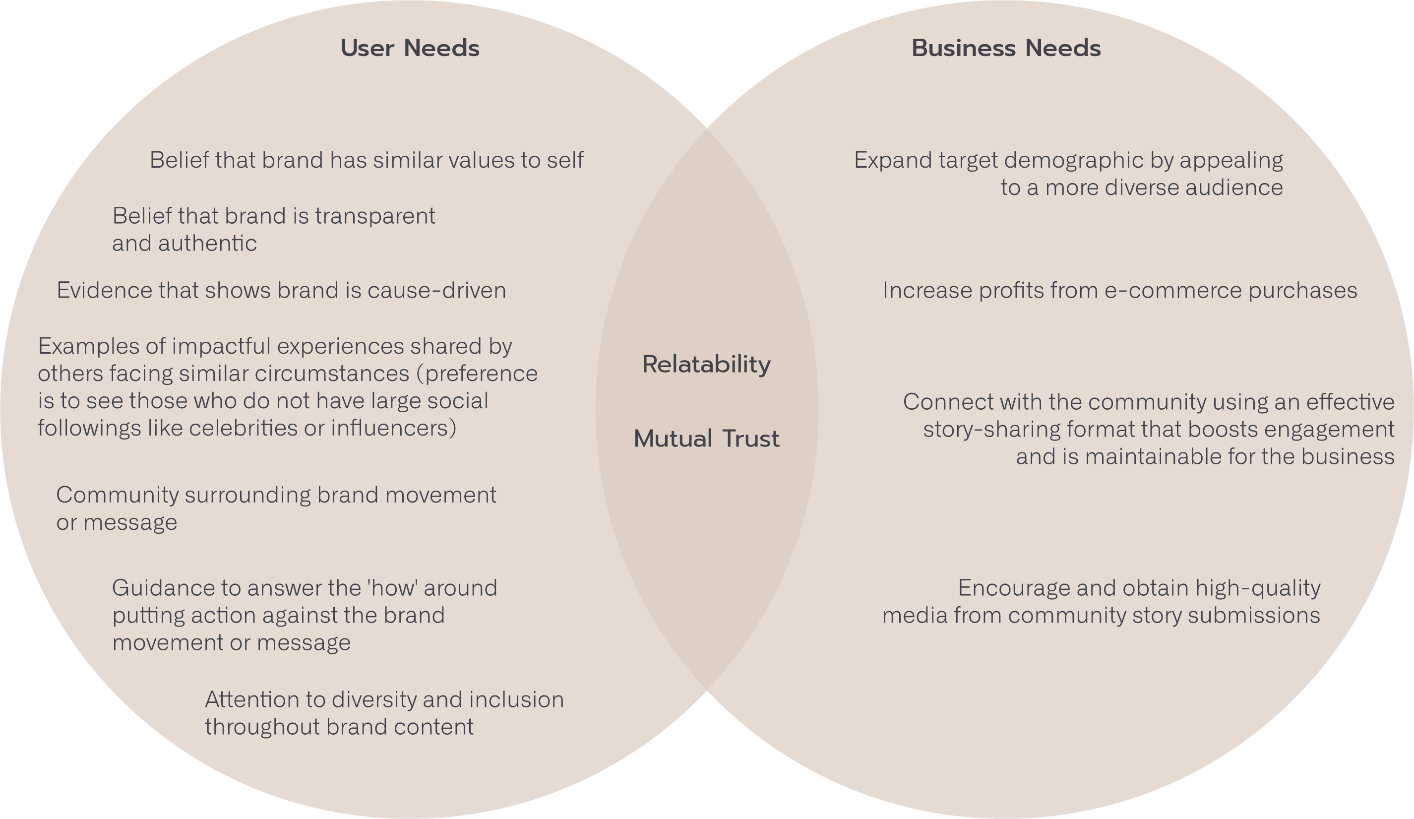
To prepare the comparision, the team first extracted patterns from the survey results through an affinity mapping exercise. With survey patterns identified and client-facing pain points understood, the next step was to uncover similarities or common themes between users and the business.
When plotting user and business needs into a venn diagram, fellow teammate Art Phung and I realized that two core needs were apparent.
RELATABILITY & MUTUAL TRUST
PAIN POINTS
User
- RELATABILITY
I don't feel a sense of belonging in the brands community because there is a narrow view of 'acceptable' stories / experiences portrayed. - MUTUAL TRUST
I can't feel inspired by a message-driven brand who's main goal is to push products rather than convey transparency or authenticity.
Client
- RELATABILITY
We need a platform to engage with community through sharing stories, reach a diverse network of people, and encourage consumer buy-in. - MUTUAL TRUST
We are not communicating the brand mission or values to new users.
PERSONA BUILDING
In addition to using survey's as a method of gathering data, the client provided demographic information that we utilized in persona building.
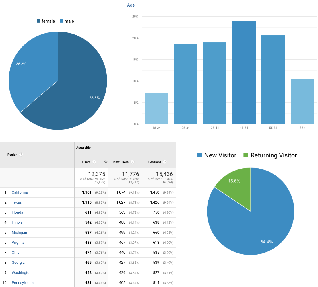
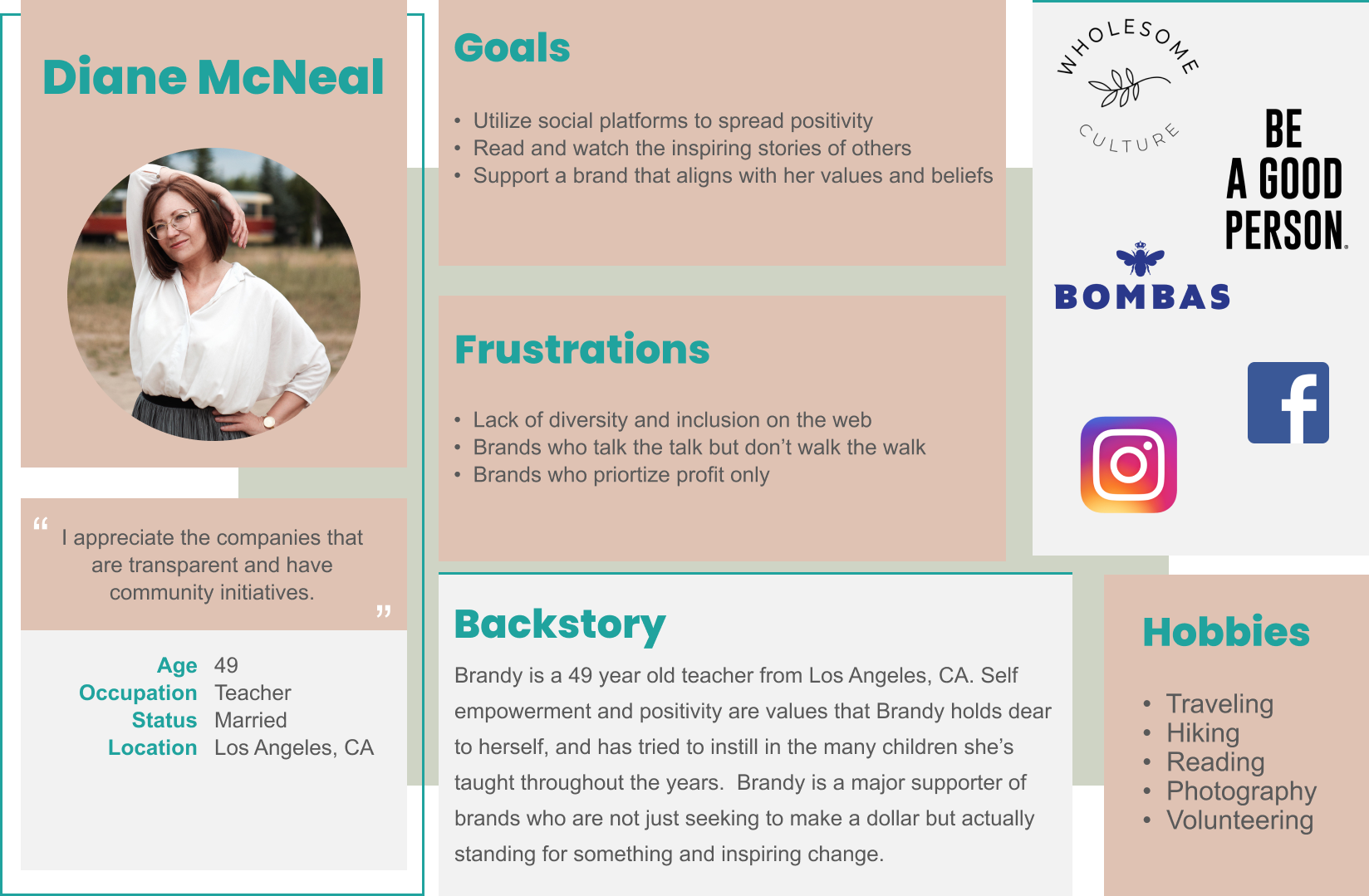
According to the google web analytics provided, the most common user is a female in her late 40's living in California. They are a new visitor to the clients website.
USER FLOWS
To scope the design changes, the team used the persona and ideated associated user flows to understand which pages needed to be updated or created as new.
Based on the user journey, visitors of the website are looking to understand the brand mission and values, as well as explore the community surrounding the movement. This information helps to form an emotional connection between the user and brand – the user realizes that the brand has similar values, and the user can picture themselves as a part of the community surrounding the brand. Only then does the business gain user buy-in.
With these touchpoints in mind, the team ideated two user flows, one to demonstrate the path of a new user or visitor not familair with the brand, the second demonstrating the journey of returning to the site to share.
SCOPE OF DESIGN CHANGES
Based on the user flows, the team identified the design scope as:
- Update the Home page
- Update About page
- Create a new page dedicated to sharing stories
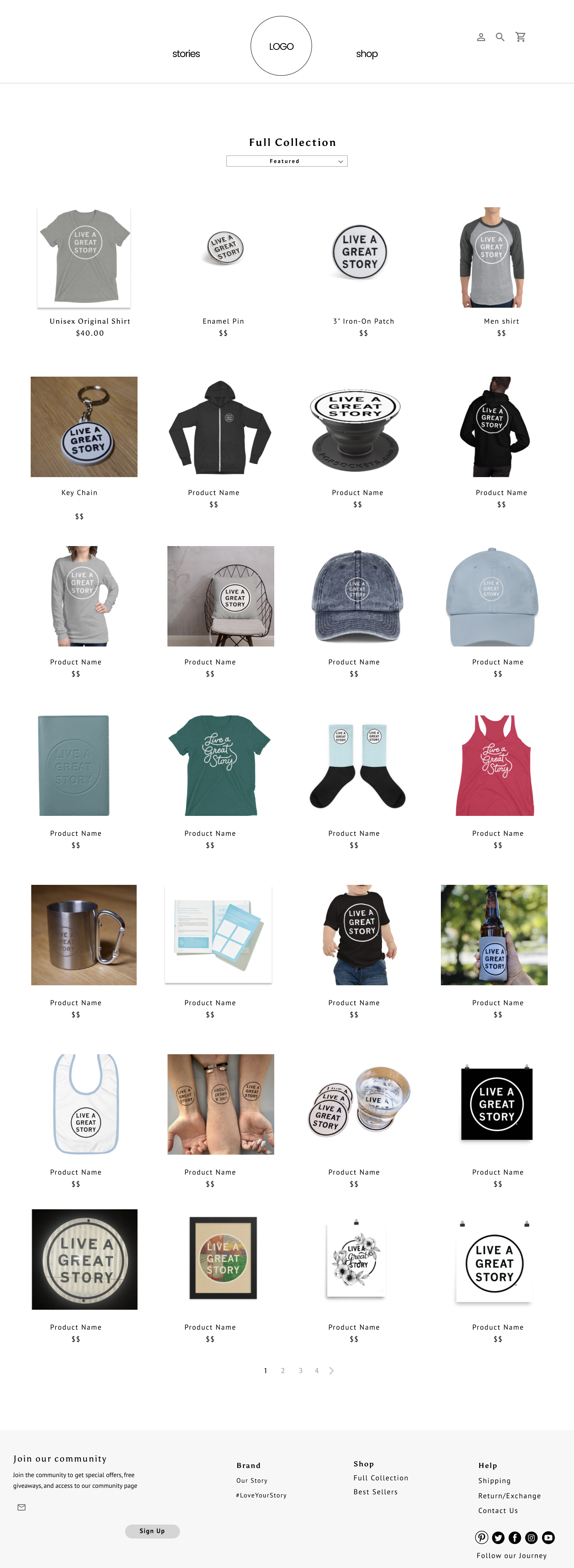
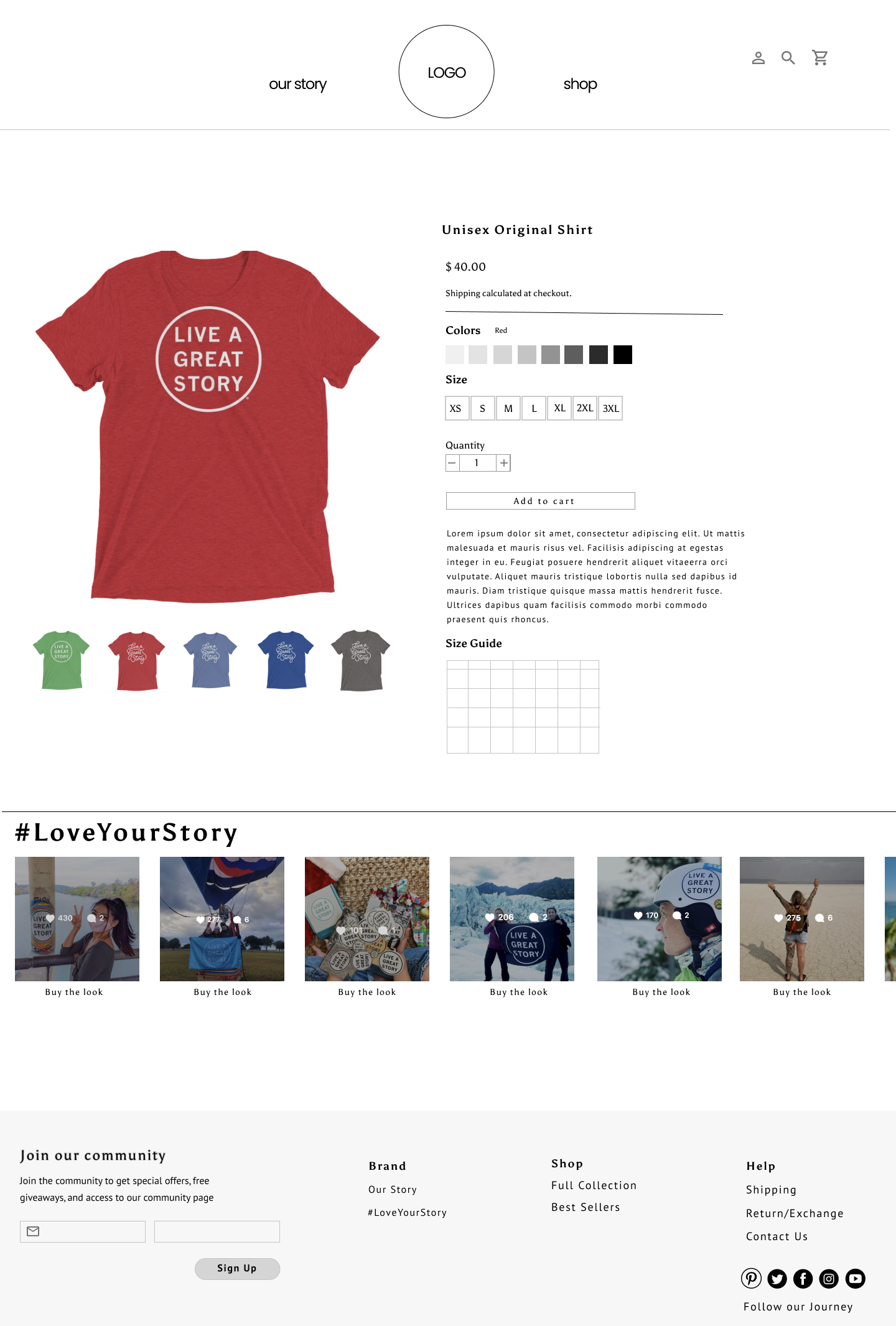
- Mock the Product List and Product Details pages
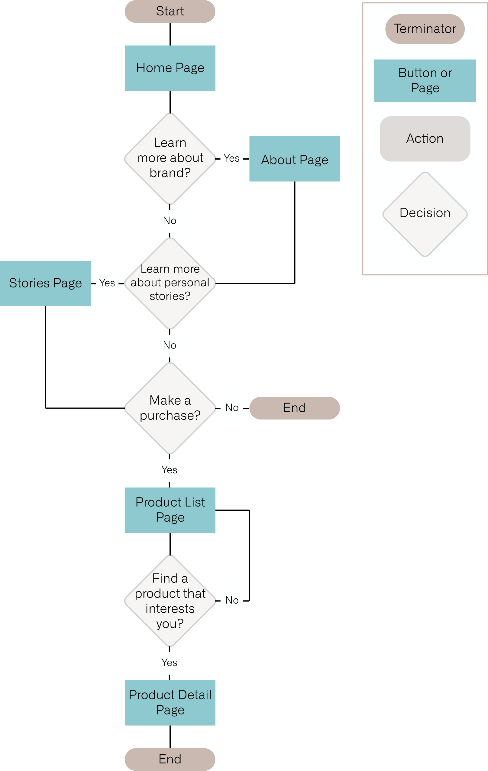
User Flow 1
Shows the path of a new visitor landing on the website, through learning about the brand and community, finishing their journey by making a purchase decision
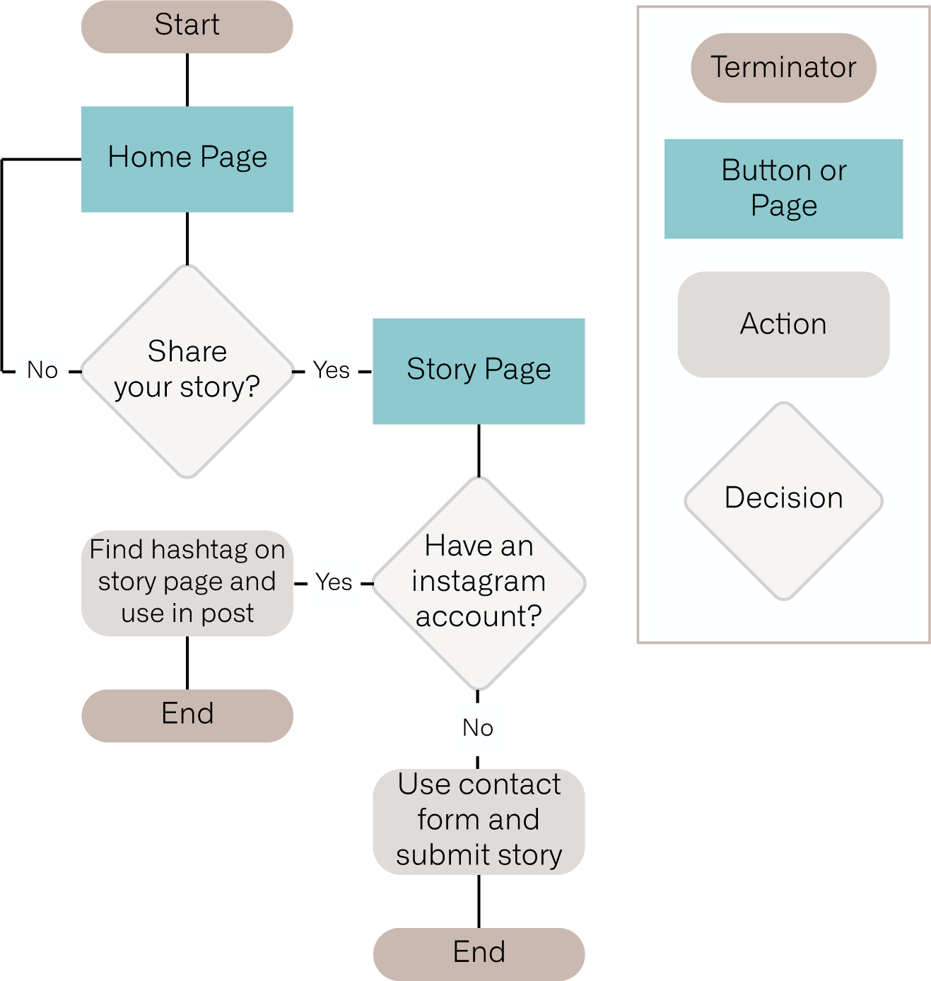
User flow 2
Shows the path of a returning visitor finding direction to share their story
How might we foster inspiration and belonging in visitors of the LIVE A GREAT STORY site?
USER
CLIENT
How might we shift the website focus from a product-centric shop to a place where diverse, inspired individuals feel encouraged to join the movement and share their stories?
EARLY DESIGN
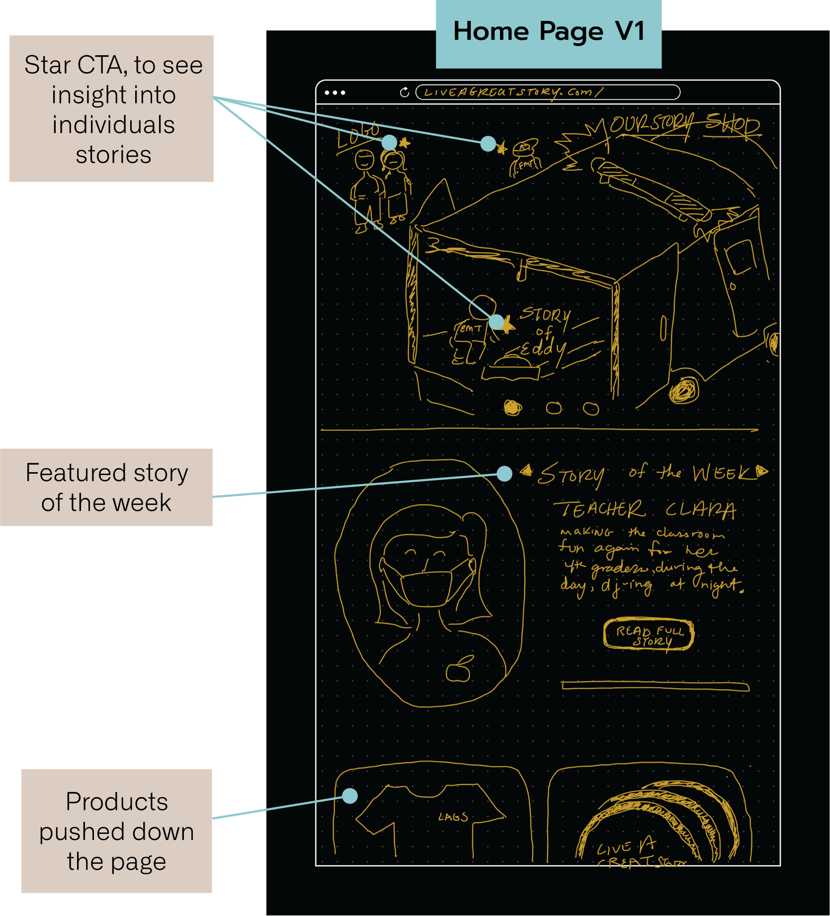
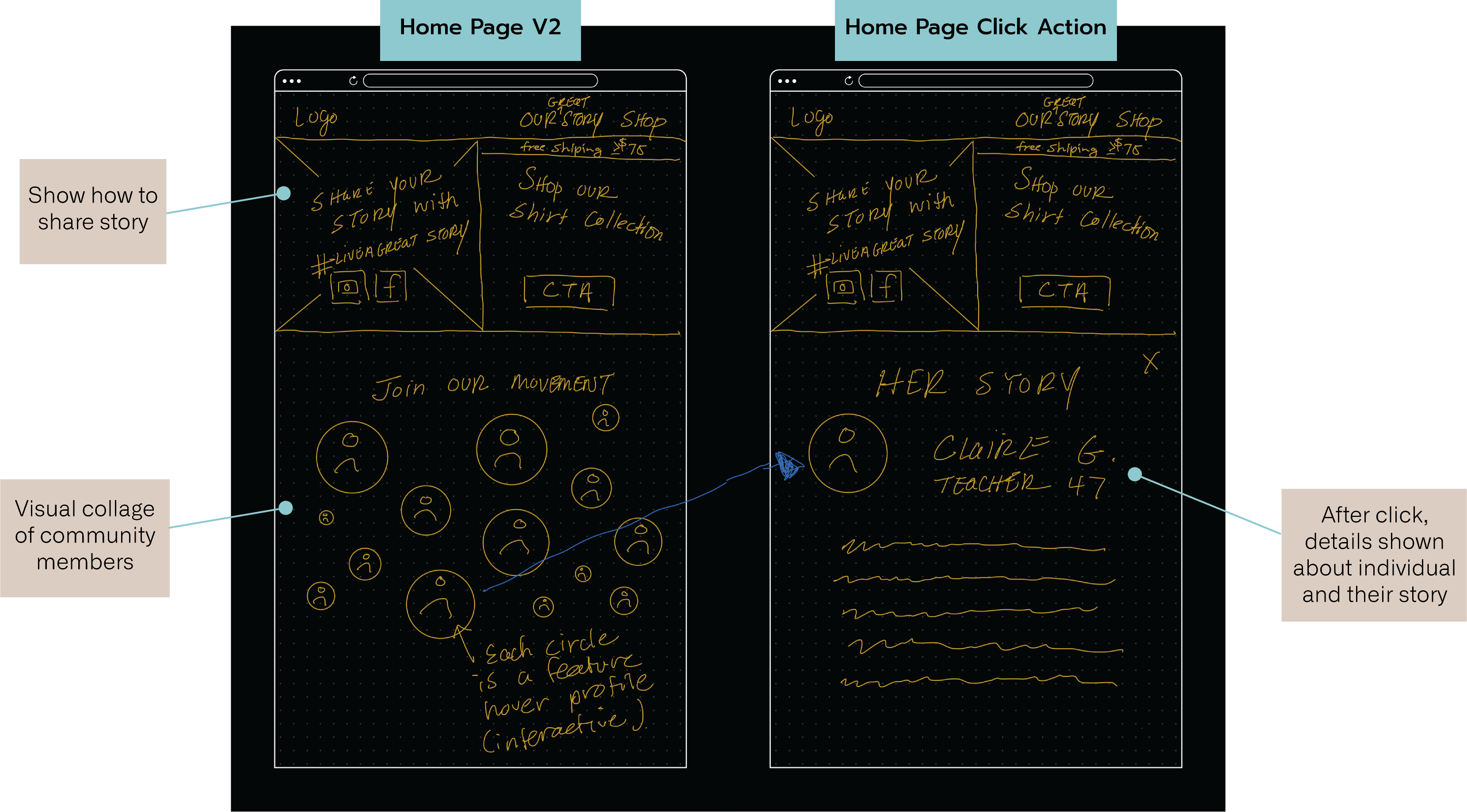
With design scope roughly defined and core client and user needs in mind, the team got to work designing new content and site layout that would bring relatability and mutual trust themes to life. The team started the design process with sketches to nail down basic direction.
DESIGN GOALS
- De-focus product on home page
- Humanize brand through use of real people in content
- Share stories from a diverse group of individuals
- Familiarize users with brand mission and values from home page
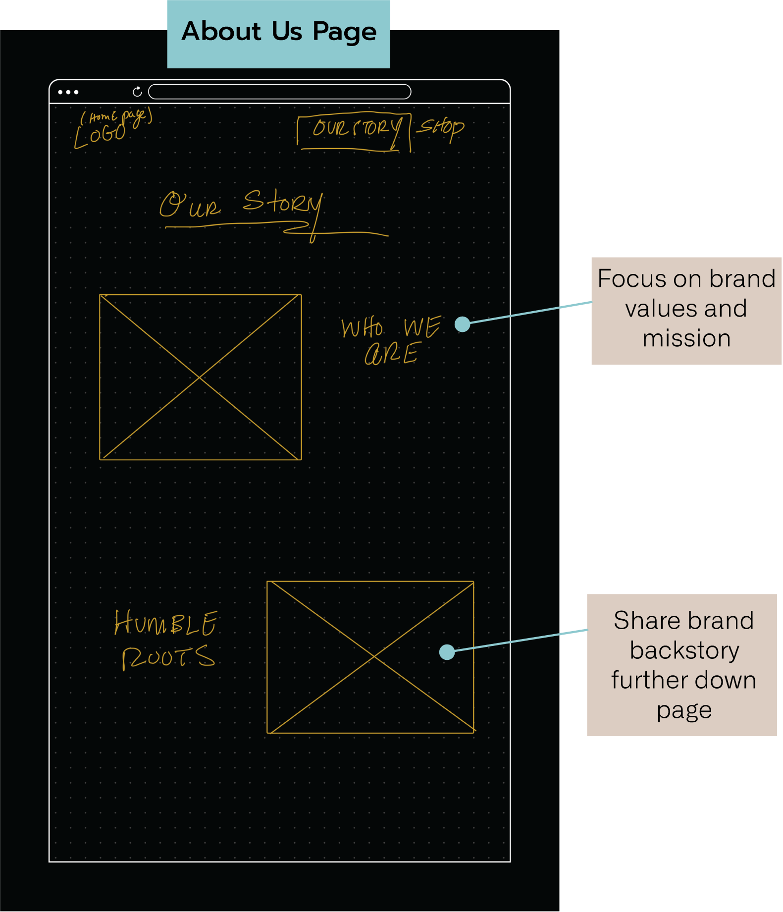
- Share brand mission and values at top of about page, then below that go into detail about the brand's story
- Communicate the importance of sharing stories, direction on how to share your story with the brand, and encourage people to share
SKETCHES
IMPROVING RELATABILITY
To address the lack of relatability reflected in the current design, we de-focused the products on the home page, pushing them further down the page opening up the hero area to communicate aspects of the individual, an attempt to humanize the feel of the brand. We had ideas like 'Story of the Week' to emphasis particular members of the community.
IMPROVING MUTUAL TRUST
The brand needs to come off more authentic and transparent. To accomplish this, the plan is to state the brand mission and values at the top of the about page. Below that, we will include the brands back story.
PROTOTYPING & TESTING
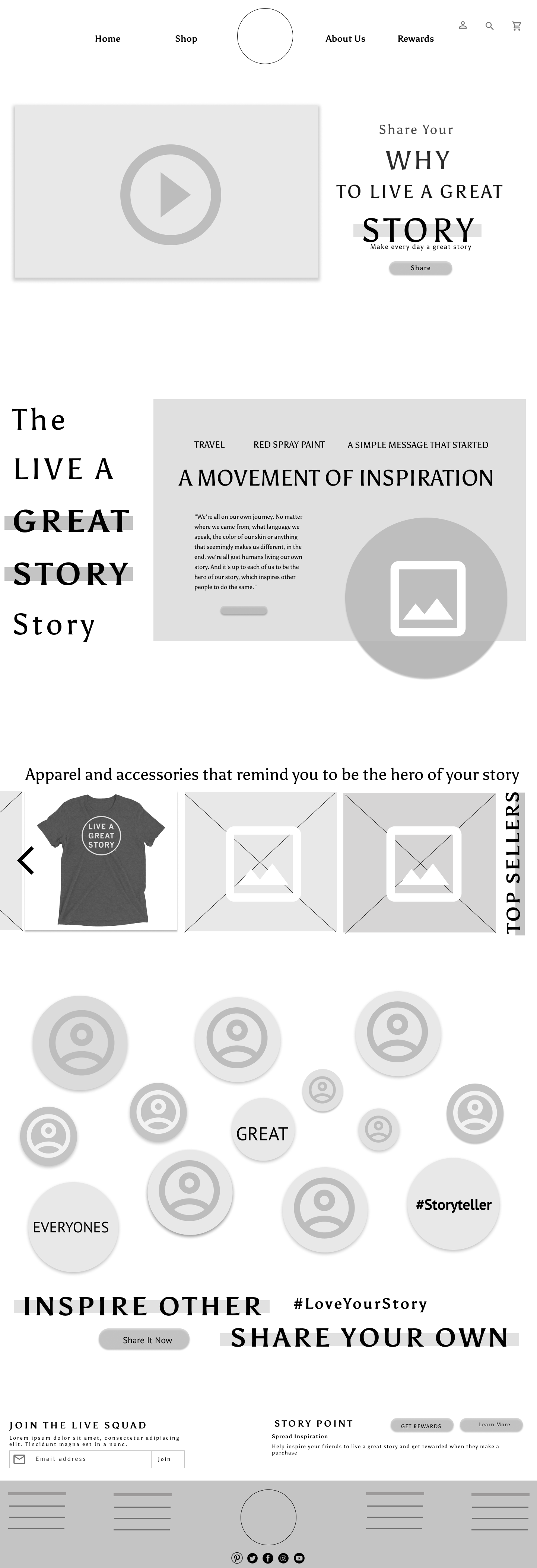
Next, we designed low-fidelity wireframe prototypes in two versions. These went through one round of usability testing with four participants. Taking round one feedback into account, the team moved into designing a mid-fidelity prototype. This prototype was tested by three participants.
To wrap up design, the last step was designing a high-fidelity prototype to be handed off to the client at the close of the project.
USABILITY TESTING ROUND 1, WIREFRAMES
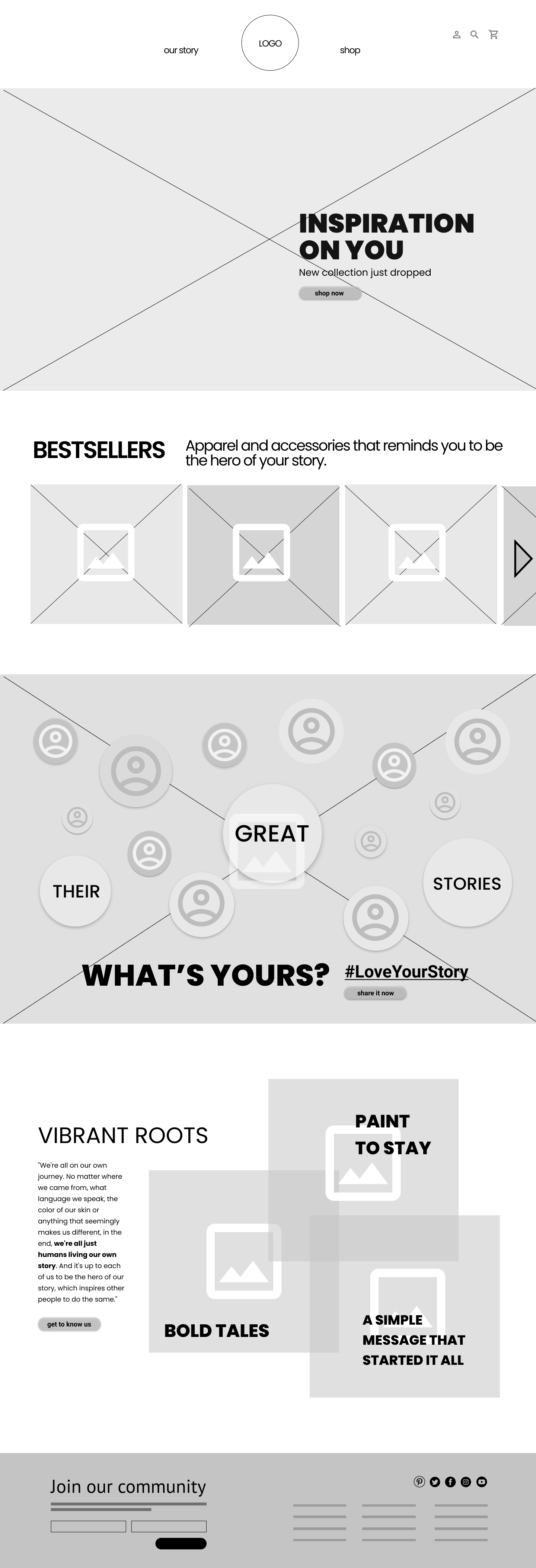
A/B TESTING OF HOME PAGE
LEFT: Product-focused | RIGHT: Story-focused
To understand perception of the brand based on the priority of content displayed on home page, the team tested two variations. Each version contains the same content ordered differently, one focused on the apparel and accessories aspect of the brand, and the other focused on the importance of storytelling and brand values.
We asked for descriptors around the purpose of the page, and the percieved concepts intended to be communicated. 100% of participants preferred the page that was story-focused (on the left.) Two participants even went so far as to mention that the page with a story-focus came off more genuine.
DIVERSITY & THE #LOVEYOURSTORY PAGE
We designed a section on the home page intended to communicate the importance of diversity and inclusion to the brand.
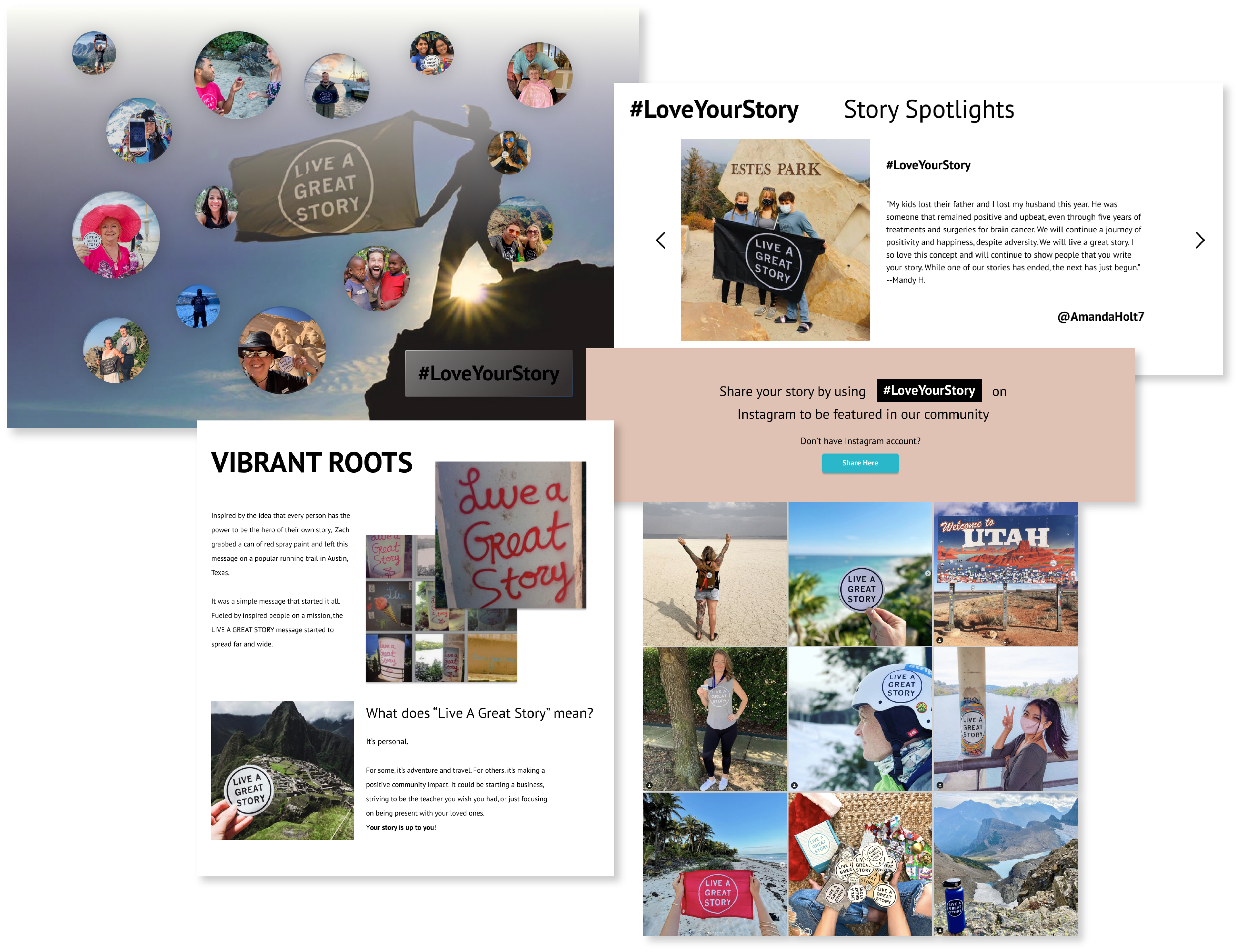
Teammate Art Phung came up with the concept of showcasing different faces organized in scattered circles with a hover feature that opens overlays sharing those individual's stories. Within that section on the home page, there is a CTA button that says 'Share it now,' indicating you can share your own story using the link.
This link leads to a community page that we named #LoveYourStory, a play on words based on the brand name LIVE A GREAT STORY. The page is intended to communicate various stories shared with the brand, as well as direction on how to be featured on the brand's website.
In testing, we asked participants to show us how they would view other community members stories, hoping they would find the #LoveYourStory page using the 'Share it now' CTA from the home page, or by using the global navigation. We found that it was not clear that the #LoveYourStory page contained both community members stories AND direction on how to share your own story. We revised this section on the home page to have title 'Our Community', and changed the CTA button text to 'discover more stories.'
CONCLUSIONS
- Story-focused home page preferred over product-focused home page
- Simple global navigation with only two links is preferred
- The content and CTA button in the diversity section of the home page needs to better indicate that the link leads to a page containing community stories in addition to direction on how to share your own story
USABILITY TESTING ROUND 2, MID-FIDELITY
Moving into mid-fidelity prototypes, the team made changes based on the first round of usability testing, and a few images were added at this stage. We completed another round of usability testing with this prototype.
We asked participants to describe first impressions of the home page, then complete a series of tasks, essentially following our defined user flow.
SCENARIO 1
You’ve come across the ‘LIVE A GREAT STORY’ brand for the first time on social media. You are inspired by some posts made by a friend referencing the brand. You want to see more stories from other people, learn more about the brand, and possibly make a purchase to join the movement.
TASKS
- Show me how you would find brand/company information.
- Show me how you would find stories shared by other members of the LIVE A GREAT STORY community.
- Show me how you would purchase a ‘Unisex LIVE A GREAT STORY’ shirt.
SCENARIO 2
Two months ago, you purchased a shirt from 'LIVE A GREAT STORY.’ Since then, you have leaned into the brand’s message and have made positive changes in your life. To give back to the community, you want to share your experiences, specifically how the ‘LIVE A GREAT STORY’ brand has impacted your life for the better. You are trying to distance yourself from social media, but you still want to share your story.
TASK
- Starting from the home page, show me how you would share your story or experience with ‘LIVE A GREAT STORY.’
CONCLUSIONS
- The more smiling faces, the better
- Diverse representation of stories and candid individuals is important and feels on brand
- Participants were fond of the introduction to the brand on the home page
- When submitting a story using an embedded form (provided for those who don't have an instagram account), participants noted they would like functionality to include videos in addition to photos
- The purpose of the story submission embedded form on the #LoveYourStory page was not clear to all folks, some believed the purpose was to subscribe to a mailing list
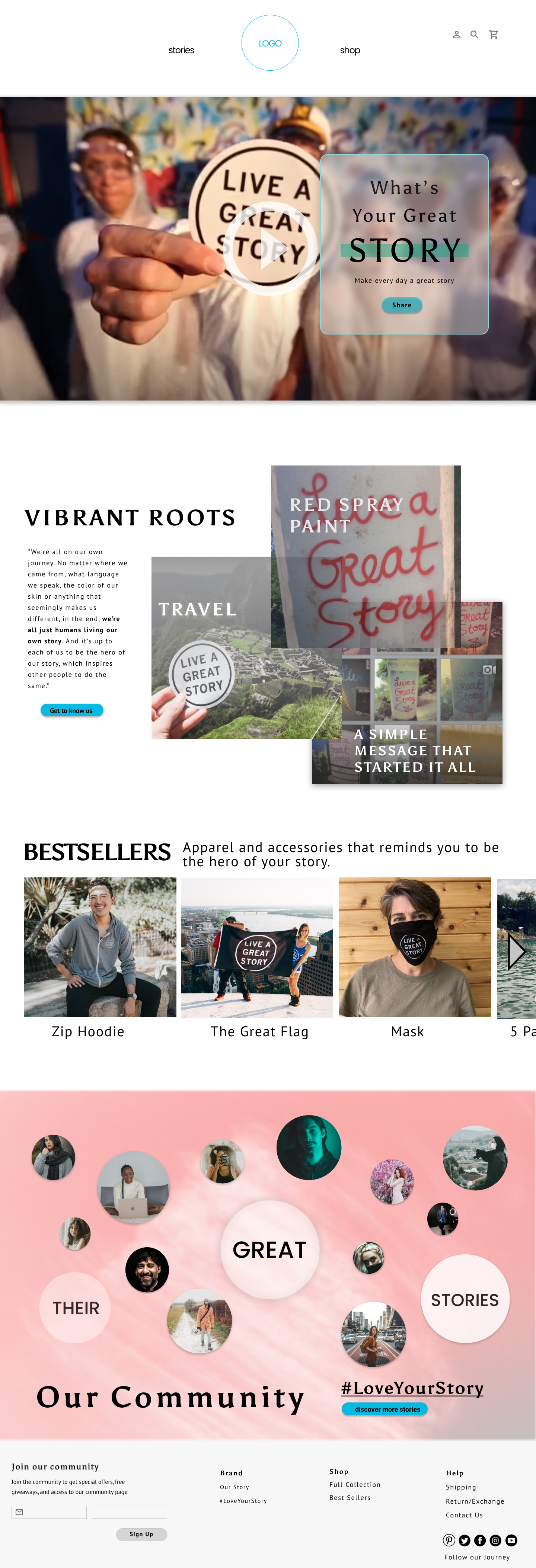
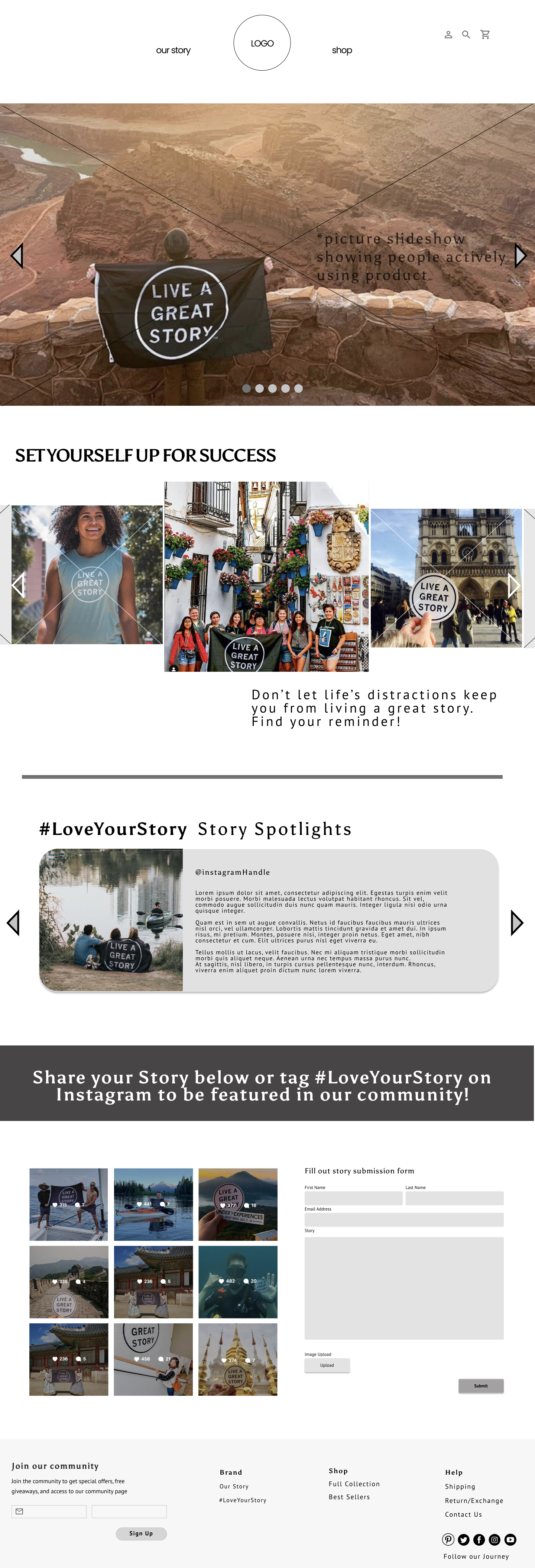
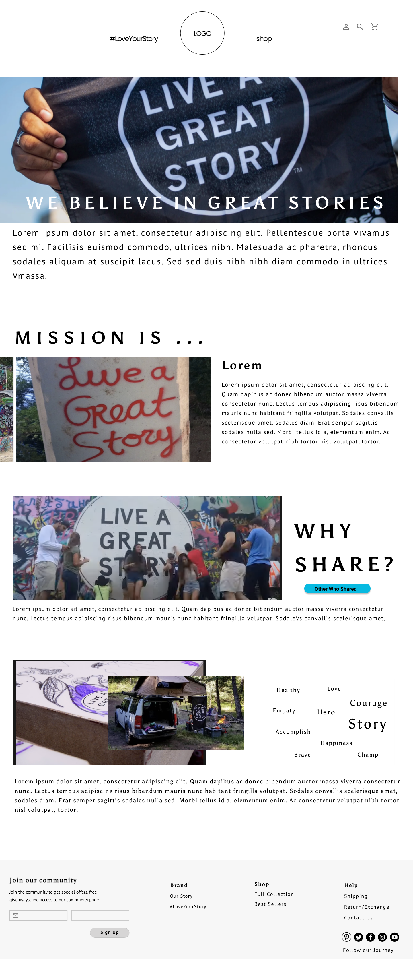
FINAL INTERACTIVE HIGH-FIDELITY PROTOTYPE
CONCLUSION
NAILING THE PROBLEM DEFINITION
After meeting with the client, the team was struggling with identifying the connection between the client-facing pain points and the potential user problem. Although we understood the client-side issues, we would not be able to define the problem until after getting insight from users.
However, how do we know what questions to ask the users? Should we focus our survey questions around understanding the user perspectives of the client-side issues, or do we cast a wider net? While it is important to consider the client-facing pain points when forming the research plan, it is crucial to avoid limiting the types of information requested from users. We did not know what the user-facing frustrations were, and we decided not to limit the feedback to the problems identified by the client.
This led to a turning point in the project, and the uncovering of the real root of the problem.
Think cause and effect. The pain points shared by the client were NOT the cause, they were effects of a bigger problem.
PROJECT MANAGER ROLE
This was a landmark project – the first time working with a client within the UX field. However, even though this was a new experience, it felt very familiar to previous work I encountered as a project manager.
I took on the project manager role for this project and was the primary liason between the team and the client. I managed all communications on topics like the Statement of Work, proposed timelines, and levelsetting expectations throughout the process.
This project's timeline of 3 weeks is shorter than I am used to, and I realized clearly defining scope and avoiding scope creep becomes especially important.
COMMUNICATION DELAYS
Adapting to risks or unexpected delays is a part of every project. Here I was reminded that it is important to establish expectations up front, make sure all parties are in agreement, but in parallel think about a plan B in case things don't work out as planned.
The team faced a delay in receving some of the materials needed to wrap up the research portion of the project. To mitigate this, I identifyed which areas of the project were directly related to those materials, and the parts that were not. We decided to move on to next stages of the project, understanding that there may be a need for small tweaks if and when we did receive those materials.
It is critical to develop skills to cope with changing requirements, timelines, resources, and budget. It is inevitable that adjustments will be required based on issues (risks that have been realized) throughout the project. These skills came in handy to me when I was involved in project management, and they apply the same way to UX projects.

